Serving Ceramics Visual Brand
Client Need:
Serving Ceramics, a startup combining a passion for pottery with a mission to give back to charitable causes, needed a logo and visual identity to reflect their values and vision. They requested a minimalistic design inspired by natural elements and handcrafted artistry.
Solution:
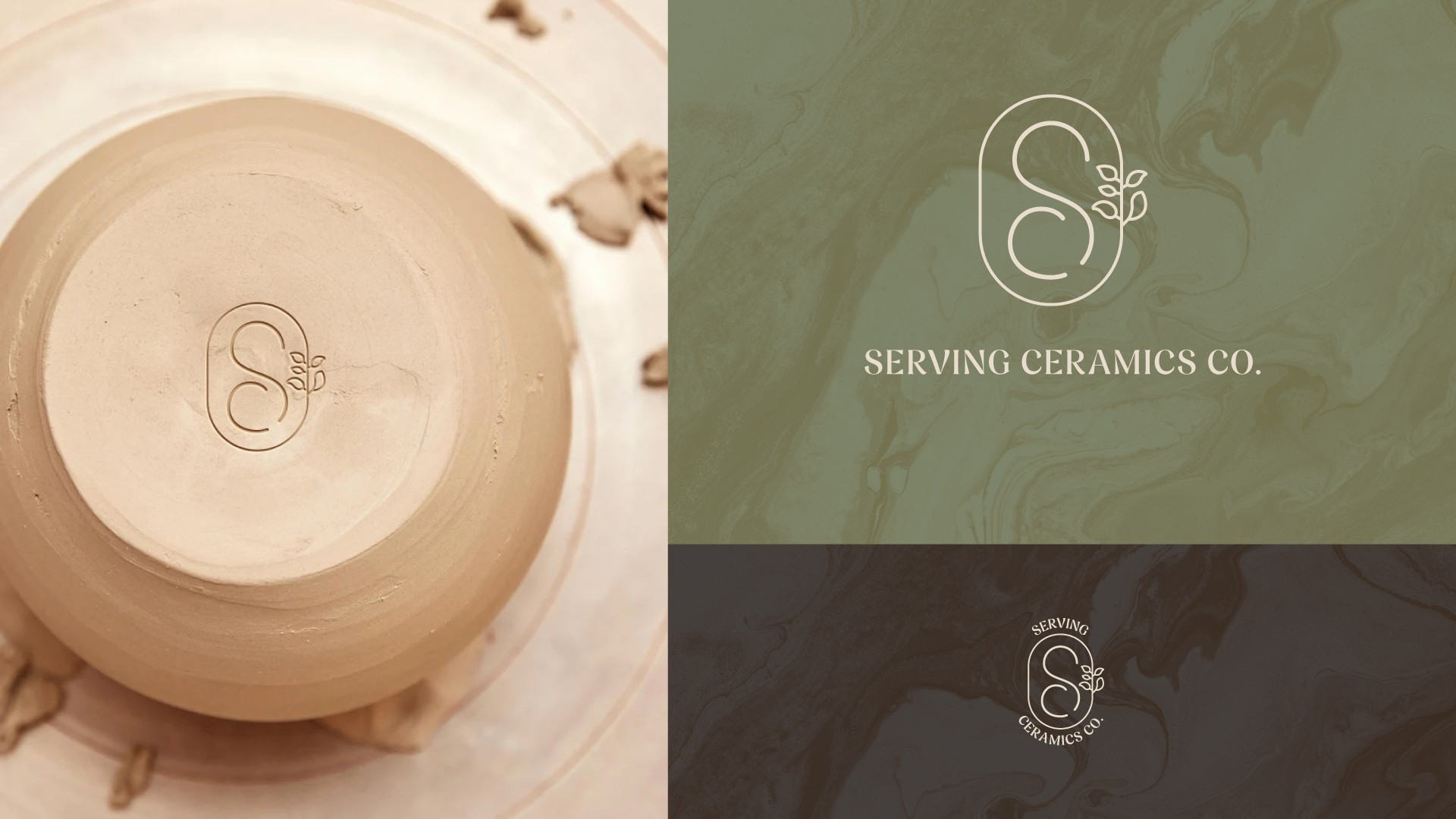
To capture the essence of Serving Ceramics, I designed a logo featuring a unique combination of the letters S and C. The design draws inspiration from the graceful and organic forms found in pottery, embodying the artistry of ceramics.
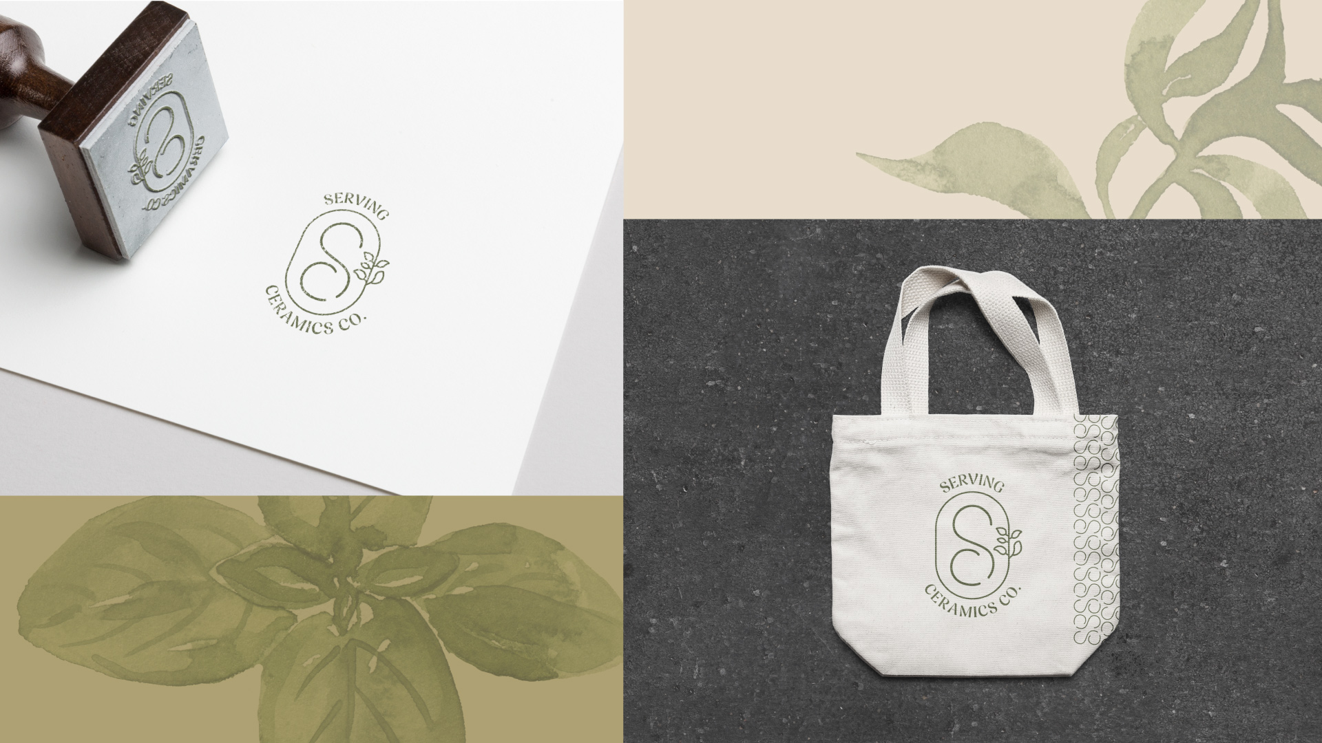
To further emphasize their connection to natural materials, I incorporated the subtle outline of a basil leaf that blends seamlessly with the letterforms and had a personal meaning for my client. This detail reinforces the brand’s ethos of craftsmanship and sustainability.
The color palette is inspired by the vibrant greens of a basil leaf, complemented by warm terracotta accents. These colors create a harmonious and earthy aesthetic, tying the visual identity to both the natural world and the craftsmanship inherent in pottery.
The result is a logo and visual identity that authentically reflect Serving Ceramics’ mission and values while standing out in the market as a modern and thoughtful brand.
About Me
I'm a Creative Director and multi-disciplinary Designer with a passion for making brands come to life. I have over 15 years of design, creative direction, and marketing experience in both agency and in-house settings.
© 2025 Jon Pope. All rights reserved.


